ARCHIVE: WORLD SERIES


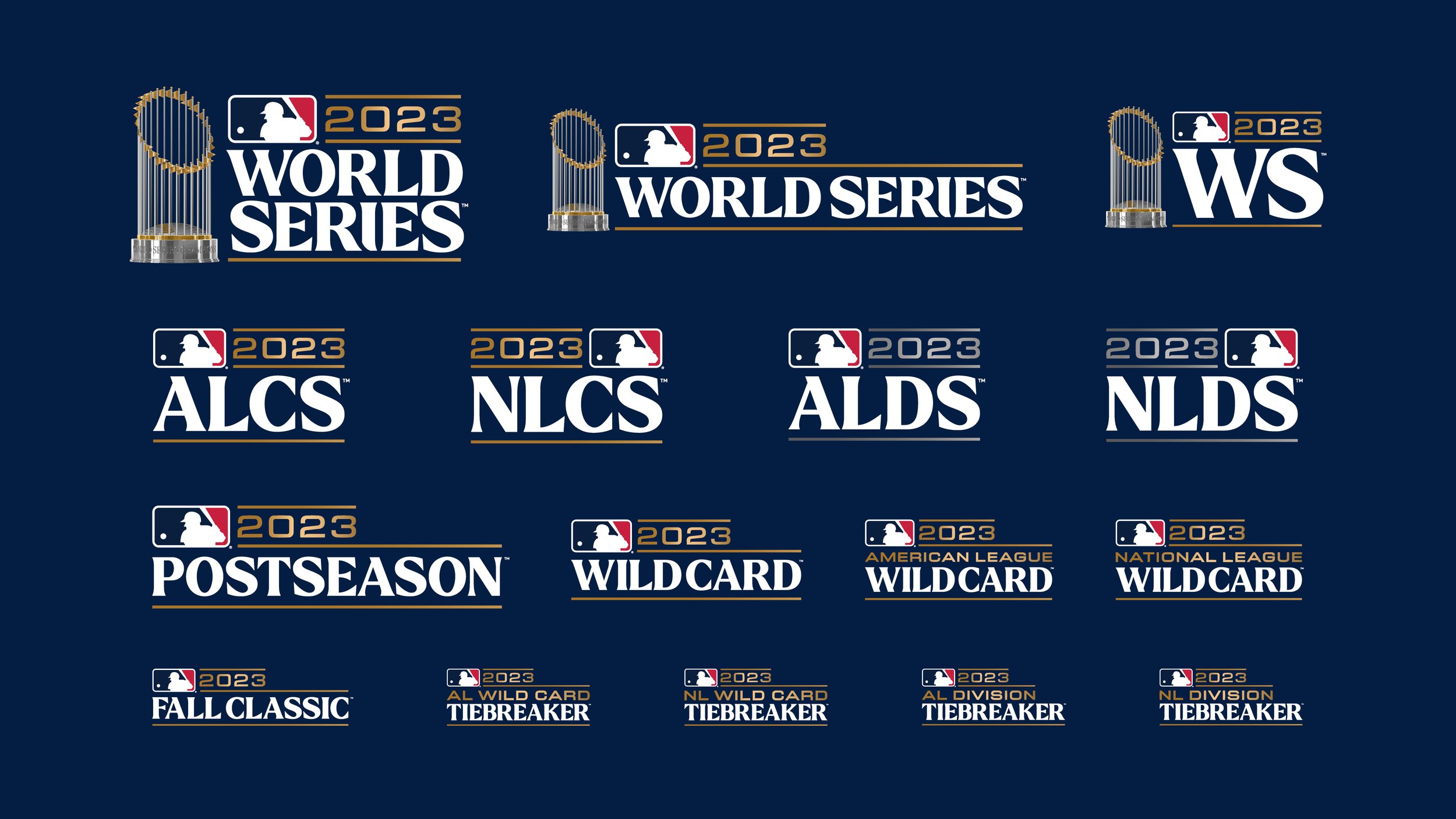
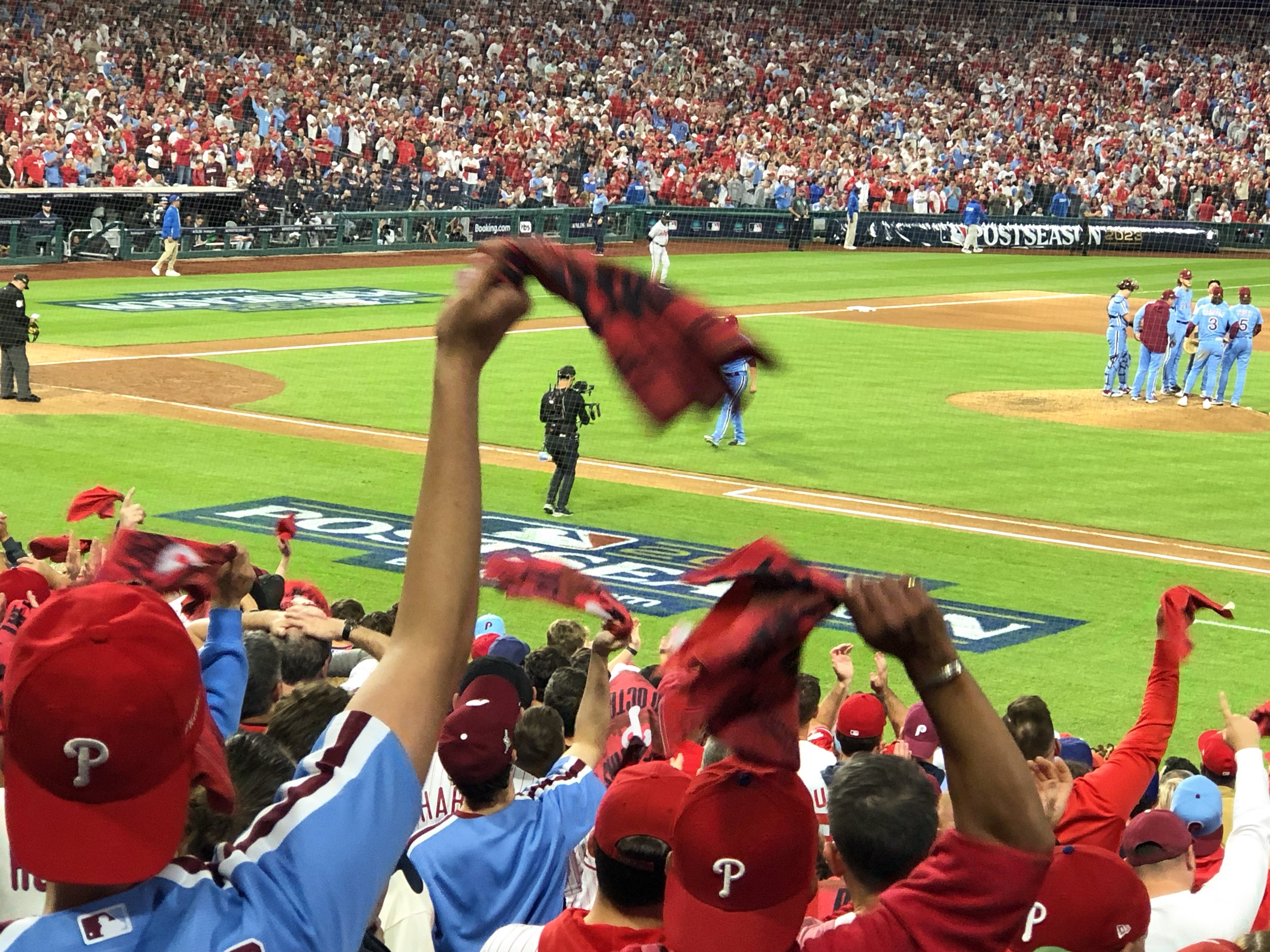
2023 | Rangers vs. Diamondbacks
For the 2023 World Series program, we continued our celebration of the iconic Commissioner’s Trophy by creating a photorealistic vector illustration as the centerpiece of the identity. To compliment the 30 pennants adorning the trophy, we developed a custom typeface - Pennant - to be used throughout the program, its flared serifs reminiscent of the golden waving flags. The Rangers would go on to win the Series in a 4-1 victory over the Diamondbacks, earning them their first World Series Championship.
Final Score: Texas Rangers (AL) 4 | Arizona Diamondbacks (NL) 1


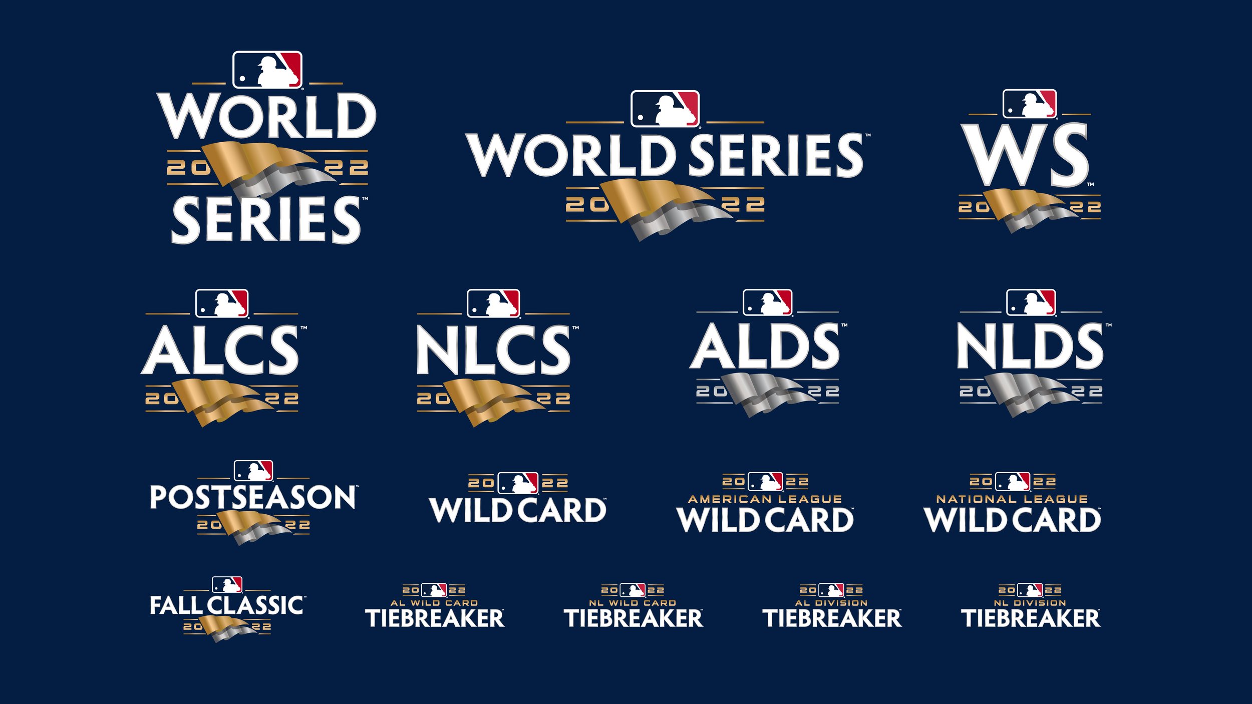
2022 | Astros vs. Phillies
Evolving the metallic look of the 2020 program, for 2022 we focused on silver and gold pennants as the main through-line of the identity: starting with the Division Series, the logos would feature a pair of silver pennants, followed by gold pennants for the Championship Series, and finally a set of both a silver and gold pennant for the World Series, symbolizing the best AL Club and the NL Club coming together to face-off. We also created a 3-dimensional render of the Commissioner’s Trophy to have a photo shoot with, allowing us to crop the trophy in unique poses for theme art that would otherwise be impossible to capture.
Final Score: Houston Astros (AL) 4 | Philadelphia Phillies (NL) 2


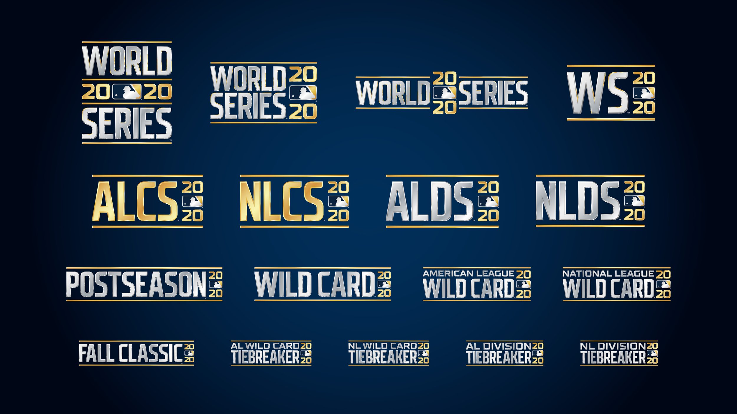
2020 | Rays vs. Dodgers
For the 2020 World Series program, we wanted to celebrate the prestige of the event and the glory associated with winning the Commissioner’s Trophy. To this end, we started with customized photorealistic metallic type and gold divider bars. We then took this typography in a 3D-rendering program and simulated how it would look if the Commissioner’s Trophy was placed directly in front of the highly reflective silver type. The results were small slivers of gold and silver appearing across the beveled edges of the type. We built a full typeface out of this, which would become the core of the program.
The 2020 Postseason and World Series would go on to be one of the most bizarre in baseball history; due to the COVID-19 pandemic, the entirely of the event was held at a neutral site in Globe Life Field in Arlington, Texas, allowing neither team home field advantage and no engagement from a live crowd of fans.
Final Score: Los Angeles Dodgers (NL) 3 | Tampa Bay Rays (AL) 1


2017 | Dodgers vs. Astros
With the scope of the program, custom typography provides instant continuity from Division Series to LCS on the the Fall Classic and all things in between. The typography used for the 2017 program features a partial gold edge that adds a special quality to the program and also reacts to light in digital animation applications.
Final Score: Houston Astros (AL) 4 | Los Angeles Dodgers (NL) 3


2012 | Tigers vs. Giants
Ink, paint, toner, thread, crystal displays, phosphor dots, plastic substrate... Without durable, adaptable art, brand control is lost due to lack of continuity. Brand art that cannot be reproduced reliably, looks disorganized and cases production nightmares for partners. Work for the 2012 Postseason displays this notion as good as David Ortiz swings a baseball bat, or, as good as Derek Jeter fields a two-hopper to short, for you Yankees fans out there. Every piece of art in this system (about 220 logos) must survive on every application on every substrate. The images below demonstrate just a few in terms of scale and application.
Final Score: San Francisco Giants (NL) 4 | Detroit Tigers (AL) 0


2010 | Rangers vs. Giants
The World Series presents a challenge that involves many related logos, wordmarks and branding elements. With broadcast networks, clubs, agencies, sponsors, partners, web-masters, media and licensees all clamoring for the many subtle variations within the core family of logos -- as well as champions marks for every division -- the program needs to be built with “good bones.”
Complex logo systems provide easy activation of a succession of tiered championships. All 30 clubs are potential Division, League and World Champions when Spring Training starts. In the case of a long championship run in Postseason, we must take all scenarios into account so that every potential win has logo art ready to deploy.
Final Score: San Francisco Giants (NL) 4 | Texas Rangers (AL) 1


2009 | Phillies vs. Yankees
When the Yankees won, we could hardly ride a subway or walk a Manhattan street without seeing someone wearing an NY cap with the WS09 logo embroidered on the side – in fact, to this day the patch pops into sight on a regular basis when we make our trips into the City That Never Sleeps. A rich and complex logo system, designed to adapt to every situation, including the Yankees' stunning win.
Final Score: New York Yankees (AL) 4 | Philadelphia Phillies (NL) 2


